Get ready to refine the design

Scotify, a Scottish music streaming service, is launching a new music app. They want to attract users to sign up, so their goal is to make their app:
- easy to learn and use
- accessible for everyone
- attractive and pleasing to look at
Your task is to take on the role of a Human-Computer Interaction researcher. You'll look at the app and evaluate how well it meets these goals.
During this evaluation, you’ll need to think about what it is that makes an app “easy to use”, and make suggestions about any usability problems you find.
Human-Computer Interaction (called HCI for short) is the study and research of how people interact with and use computing systems. It focuses on how to make computers, apps, and websites easier to use.
Which of these activities would you expect a Human-Computer Interaction researcher to do as part of their job?
What makes an app easy to use?
As an HCI researcher, you'll evaluate the usability of the Scotify music app and suggest changes to make it more appealing and easier to use. To do this, you'll need to think about your own experiences of using apps and websites - and what makes them fun, or frustrating, to use.
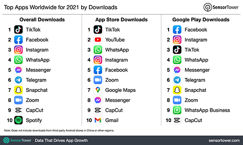
Here's some of the most popular apps. Do you use any of these? Do you find any of them fun or frustrating to use?
Name an app or website that you enjoy using, or find really easy to use.
Name an app or website that you find frustrating, or difficult to use.
Keep watching the livestream.
We will share some of your answers.
More questions will appear soon.
Choosing and designing icons
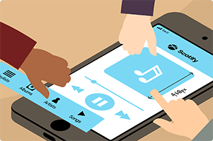
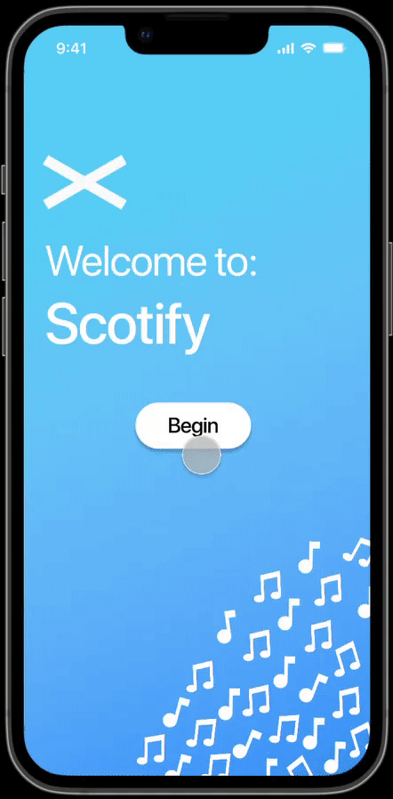
The Scotify music app uses icons as part of their interface.
A good icon represents the action you want to take and is relevant to something the user might have seen in the real world.
When choosing an icon, it must be recognisable and simple. HCI designers often use a “metaphor” or “symbolism” when designing interfaces.
Often the icon is a picture which represents the action the user wants to take.
For example, this icon ![]() symbolises cutting something out of a page with a pair of scissors.
symbolises cutting something out of a page with a pair of scissors.
Which of these icons is normally used to represent printing a file?
HCI designers have a rule of thumb that an icon should be a “Match between the system and the real world”.
HCI researcher Jakob Nielsen says:
“The design should speak the users' language. Use words, phrases, and concepts familiar to the user, rather than internal jargon. Follow real-world conventions, making information appear in a natural and logical order.”
Why is this printing icon a good design decision?
Scotify wants app users to be able to delete songs from their music library. Which of these icons would you recommend they use for this feature?
Let’s make another icon design decision.
Scotify wants users to be able to keep a note of songs they enjoy listening to. When they press a button that track will be added to a playlist of their favourite songs.
Which of these icons would you recommend Scotify use for this feature?
Design an icon
The Scotify app has a feature where the user can press a button and the lyrics to the current song are shown on the screen.
In the box, sketch an icon that you think could represent that feature.
Once you’ve finished, press the button to submit your design
Tell us about your icon
Choosing icons that are easily identifiable and make sense to the user is an important part of making the Scotify music app more usable. These design decisions make the app easy to learn and use.
Keep watching the livestream.
We will share some of your answers.
More questions will appear soon.
Accessibility and designing for everyone
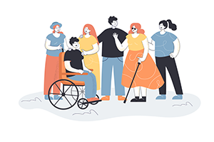
Scotify has made a promise to make their app accessible to everyone.
Making an app accessible means making sure it can be used by as many people as possible. Including people with:
- Impaired vision
- Motor difficulties
- Learning difficulties
- Deafness or loss of hearing
To help these users, it’s important that the Scotify app follows strict accessibility guidelines.
About 67 million people live in the UK. How many of these people do you think have a disability?
Designing for people with Visual impairments:
There are two key ways that HCI designers can create interfaces accessible to people with visual impairments like blurred vision, or colour blindness.
Size adjustable text is important because it allows the user to change the way text looks. They can set it to a size that allows them to read the on-screen content more easily.
High colour contrast, means how easy it is to see or read text, images, or icons on different coloured backgrounds. For example, light yellow text is tricky to read on a white background.
Colours shouldn't be too similar or contain colour combinations that people with colour blindness find difficult to see. People with deuteranomaly, a type of colour blindness, may struggle to differentiate between reds, oranges, and browns.
Scotify has asked you to choose colours for their app with good contrast between them. Select one of the combinations below that is easiest to read.
Designing for people with poor motor skills:
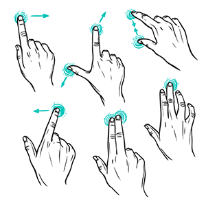
Motor skills let you move your hands and fingers easily. It is important to account for users with motor control disabilities and design accommodations to make navigation easier.
Two ways that HCI researchers can do this are:
Make button sizes large enough so it is easy to press, even if the phone cannot be held steady, or the user finds it difficult to touch accurately.
Keeping consistent layouts across pages so buttons are in a predictable place. This makes it easier for people who have to grip the phone a certain way to reach areas of the screen.
Scotify needs to add a Back button in their app. This button is very important as it allows users to navigate to previous places in the app easily.
Remember, this button must be accessible to people with poor motor skills.
The designers have produced two mockup screenshots of different places the Back button can be.
Thinking as an HCI researcher, select the mockup you think would be best for users with limited motor skills.
Designing for learning difficulties like dyslexia:
Dyslexia is a common learning difficulty that affects roughly one in ten people in Scotland. Often, people with dyslexia may have more difficulty reading and writing than others.
Two ways HCI researchers can make using an app much easier for someone with dyslexia are:
Choosing large, clear fonts helps people differentiate between letters and makes it easier to read and understand the words.
Keeping lines short, and spacing out paragraphs helps keep instructions simple, and focuses the user's attention.
The Scotify design team has suggested 3 different fonts to use within the app. Which one would you recommend they use?
Remember, the font needs to be easy to read as it will be used everywhere in the app.
Identify the accessibility issues
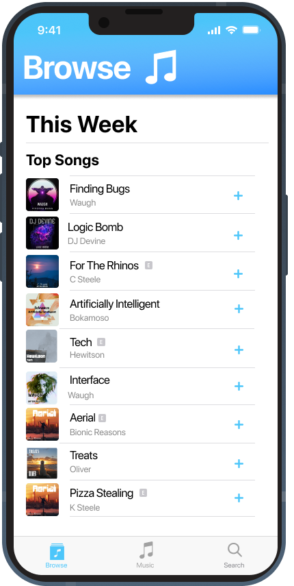
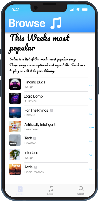
Scotify was informed of accessibility issues in the top songs page of the app.
The reported issues were:
- A user with dyslexia found it difficult to read the text in parts of the app
- A user with a hand tremor couldn't add a song to the playlist
- A user with cataracts found it difficult to understand when a menu item was selected
Scotify has tried to fix these issues to ensure the app is accessible to everyone.
Tap on areas where accessibility changes had to be made to the app.
Can you spot all 3 differences in the right hand screenshot?
Look at these two screenshots of the “Top Songs”.
The left screenshot shows what the app looks like after the fixes. The right screenshot shows how the app looked originally.
Tap on 3 areas in the right screenshot with accessibility issues.
Found 0 of 3.
By taking into account these guidelines and best practices you have helped to make the Scotify app accessible for everyone.
Keep watching the livestream.
We will share some of your answers.
More questions will appear soon.
You did it! - Well done
Today you thought like a Human Computer Interaction researcher.
You learned that apps should be: easy to learn and use, attractive and pleasing and accessible for everyone.
By evaluating the Scotify app you:
- Investigated what makes an app “easy to use”
- Learned how icons are used to make an interface
- Designed an icon for a new feature in the app, following the principles of metaphors, consistency, and standards.
- Made design decisions that considered the needs of users with disabilities like visual impairments, motor difficulties, and dyslexia.
- Identified some accessibility issues and helped make the Scotify app usable by more people.
If you enjoyed looking at the Scotify app and improving its usability — you'd make a great Human Computer Interaction specialist!
If you want to find out more about careers in Human Computer Interaction, check out the Digital World website.
Feedback
Well, what did you think? Tell us your feedback.
Share feedbackDid you enjoy this?
We've got lots of other activities that you can try out on the Cyber Skills Live website.
Graphic credits
Motor Skills Design vector created by macrovector — Freepik
Poor Visibility disability icons created by Freepik — Freepik
Inclusive People vector created by pch.vector — Freepik
Music Player Icons was designed by — Chima Okehie
People using smartphones vector created by freepik — Freepik
Music vector created by storyset — Freepik